Thursday, January 28, 2016

Wednesday, January 27, 2016
6 Designers
Fred Woodard:
Fred Woodard played an important role in the design industry. He was best known for his legendary work in the Rolling Stone Magazine, where he had been working for 14 years. He worked with typography and photography in the Rolling Stone and changed it for the better. The positioning of groups of words, or letters created an emotion or expression.
Woodard was an influential designer not only because of being president of society of publication Design and the youngest member in the NY art director Hall of fame, but was also nominated for 8 National Magazine awards, including general excellence, design, photography, and photo portfolio.


Gail Anderson:
Gail Anderson's importance in the design world was also by working for the Rolling Stone Magazine from 1987 to 2002 as a designer, deputy art director, and senior art director. She was also the designer at the Boston Globe Sunday Magazine and Vintage Books. She has received awards from major design organizations included society of publication designers, the American Institute of Graphic Arts, and the Art Directors Club. Lastly, she was the recipient of the 2008 lifetime achievement medal from the AIGA and has lectured about design at organizations and conferences around the world.


Alexi Brodovitch:
Remembered as the art director of Harper's Bazaar for nearly a quarter of a century. He played a crucial role in introducing into the US a radically simplified "modern" graphic design style forged in Europe in the 1920s from an amalgam of vanguard movements in art and design. He took an active role in conceiving and commissioning all forms of graphic art and he specialized in discovering and showcasing young and unknown talent. Throughout his career, he continued to teach. He was inspiring though sometimes harsh and unrelenting.


Fred Woodard played an important role in the design industry. He was best known for his legendary work in the Rolling Stone Magazine, where he had been working for 14 years. He worked with typography and photography in the Rolling Stone and changed it for the better. The positioning of groups of words, or letters created an emotion or expression.
Woodard was an influential designer not only because of being president of society of publication Design and the youngest member in the NY art director Hall of fame, but was also nominated for 8 National Magazine awards, including general excellence, design, photography, and photo portfolio.
http://www.csun.edu/~pjd77408/DrD/Art461/LecturesAll/Lectures/PublicationDesign/DigitalTimes/Fred-Woodward.html
https://salahsultan.files.wordpress.com/2012/06/salah-sultan-biography-of-fred-woodward.pdf
Gail Anderson:
Gail Anderson's importance in the design world was also by working for the Rolling Stone Magazine from 1987 to 2002 as a designer, deputy art director, and senior art director. She was also the designer at the Boston Globe Sunday Magazine and Vintage Books. She has received awards from major design organizations included society of publication designers, the American Institute of Graphic Arts, and the Art Directors Club. Lastly, she was the recipient of the 2008 lifetime achievement medal from the AIGA and has lectured about design at organizations and conferences around the world.


http://www.gailycurl.com/Rolling-Stone
Tibor Kalman:
In the mid- 1980s two names changed graphic design Macintosh and Tibor. Kalman died in 1999 of lymphoma. He was very influential and defined good design as "unexpected and untried." He believed it should be used to increase public awareness of a variety of social issues. He even had his own design firm M&Co which started in 1979 selling conventional "Design by the Pound" to banks and department stores. He had his own magazine, colors, which he became editor-in-chief and rejected fashion magazine cliches in favor of sociopolitical issues. It was the first magazine for the global village Tibor announced.


http://www.aiga.org/medalist-tiborkalman/
http://www.nytimes.com/1999/05/05/arts/tibor-kalman-bad-boy-of-graphic-design-49-dies.html?pagewanted=all
Alexi Brodovitch:
Remembered as the art director of Harper's Bazaar for nearly a quarter of a century. He played a crucial role in introducing into the US a radically simplified "modern" graphic design style forged in Europe in the 1920s from an amalgam of vanguard movements in art and design. He took an active role in conceiving and commissioning all forms of graphic art and he specialized in discovering and showcasing young and unknown talent. Throughout his career, he continued to teach. He was inspiring though sometimes harsh and unrelenting.


http://www.aiga.org/medalist-alexeybrodovitch/
Neville Brody:
According to Fontfont.com. Brody is perhaps the best known designer of his generation. He spent 3 years studying at the London college of printing where his work , which was quite experimental in nature, was met with unfavorable criticism because the school generally taught traditional printing methods. He was the art director for the Face magazine where he worked from 1980 to 1993. Brody was also a major contributor to FUSE and was an avid user of the computer as a design tool during its developmental stages. He has designed several popular typefaces including Arcadia, Industria, Insignia, FF blur, FF pop, FF gothic, and FF Harlem.


http://www.identifont.com/show?16X
http://www.designishistory.com/1980/neville-brody/
https://www.fontfont.com/designers/neville-brody
David Carson:
Carson was a High school teacher before becoming a designer. In 1989 he qualified as the 9th best surfer in the world. His interest in the world of surfing gave him the opportunities to experiment with design working on several different publications related to the profession. He redesigned Surfer magazine and art directed and designed it for the next 2 years before Raygun. It was Raygun where he gained the most recognition and was able to share his design style.


https://en.wikipedia.org/wiki/David_Carson_(graphic_designer)
http://www.designishistory.com/1980/david-carson/
Monday, November 2, 2015
Wednesday Oct. 28 Blog Homework
1) Small capitals are uppercase characters set at the same height/weight as lowercase letters used in running text to prevent capitalized words from appearing too large on the page. Also used in place of italics. Small caps draw attention more than regular capitals and are more aesthetically pleasing.
2) The original Futura design concept included small capitals. Dropped from original metal issue of the type and first offered digitally by Neufrille Digital under the Futura ND family.
3)Ligature is two or more letters joined together to form one character. Helped some practical typesetting problems. fi and ae. Futura does not have ligatures. The font is too geometric it would look very awkward. A font that does use ligatures is Mrs. Eaves.
5) The difference between a foot mark and apostrophes is footmarks are straight while apostrophes are curved.
6) Hyphens, en dashes, and em dashes are somewhat similar in appearance but different in length and meaning. Hyphens glue words together and notify the reader of two or more elements in a sentence that are linked. En dashes connect things that are related to each other in distance. Like may-september issue of a magazine. Em dashes are similar to parenthesis and are for additional thoughts to be added.
2) The original Futura design concept included small capitals. Dropped from original metal issue of the type and first offered digitally by Neufrille Digital under the Futura ND family.
3)Ligature is two or more letters joined together to form one character. Helped some practical typesetting problems. fi and ae. Futura does not have ligatures. The font is too geometric it would look very awkward. A font that does use ligatures is Mrs. Eaves.
5) The difference between a foot mark and apostrophes is footmarks are straight while apostrophes are curved.
6) Hyphens, en dashes, and em dashes are somewhat similar in appearance but different in length and meaning. Hyphens glue words together and notify the reader of two or more elements in a sentence that are linked. En dashes connect things that are related to each other in distance. Like may-september issue of a magazine. Em dashes are similar to parenthesis and are for additional thoughts to be added.
Monday, October 19, 2015
Futura: Font Info & Definitions/ Identifications
-Sans Serif
-Designer: Paul Renner
-Other Fonts Designed: Plak (1928), Futura Black (1929), Futura Light (1932), Ballade (1937), Renner Antiqua (1939), Steile Futura (1954)
-Classification: Geometric Sans Serif
-Family Members: Futura: Light, Light Oblique, Book, Book Oblique, Medium, Medium Oblique, Bold, Bold Oblique, Extra Bold, Extra Bold Oblique.
1) Modern
Define: Thin, straight serifs, a vertical axis, and sharp contrast (thick to thin strokes).
Examples: Aster, Didot, and Ellington.
2) Old Style
Define: Bracketed Serifs and slight weight differences between the thick and thin parts of the letters. Documented in use since early 1420s.
Examples: Garamond, Bembo, Jenson, and Palatino.
3)Transitional
Define: Similar to Old Style typefaces, they have higher contrast between the weights of thick and thin lines.
Examples: Times Roman, Baskerville, and Adriane Text.
Stoke Weight:
The degree of contrast between the thin and thick strokes in a typeface or the thickness of lines in a font character.
Stress/Axis:
-The diagonal, vertical, or horizontal thick to thin transition in the stroke of a letter.
-A typeface with uniform strokes has no apparent stress.
-Old Style fonts like Garamond show diagonal stress.
-Transitional fonts like Times New Roman show a much less pronounced diagonal stress.
-Modern fonts like Bodoni have strong Vertical Stress.
Small Caps:
Are shrunken versions of full size caps. They are designed to match the x-height of lowercase letters.
Lining Figures:
Take up uniform widths of space, helping the numbers to line up when arranged in columns.
Non-aligning Figures:
Have ascenders and descenders, like lowercase letters. Are proportional and has own set width.
Ligatures:
Two or more letters are joined as a single glyph.
Summarizing Type Measurement:
Type is measured in points. For example, a 10 point type measures from baseline to baseline 10 points. While the fonts are ALL 10 points, some may look bigger or smaller than others but take up some depth line to line.
Baseline:
The line which most letters sit and below which descenders extend.
X-Height:
Distance between the baseline and the mean line of lowercase letters in a typeface. Usually the height of "x" in a font.
Cap Height:
Refers to the height of a capital letter above the baseline for a particular typeface. Specifically refers to the height of capital letters that are flat like "H" and "I".
Ascender:
Portion of a small letter that extends above the mean line of a font. If the part of a lower case letter is taller than the font's x-height.
Descender:
A portion of a letter that extends below the baseline of a font.
Arm:
A longer horizontal stroke at the top or bottom, like E, F, L, and T.
Leg:
Short, descending part of a letter.
Tail:
A trailing outstroke as in j, k, y, J, and K.
Eye:
The eye refers to specifically to the enclosed space in the lowercase "e".
Apex:
A point at the top of a character where two strokes meet.
Crossbar:
Horizontal stroke in letters.
Counter:
Areas of negative space formed by straight or curved strokes.
Bowl:
A closed curved stroke.
Link:
Stroke that connects the top and bottom bowls of lowercase.
Ear:
Very short stroke at the top.
Loop:
Bottom of the two-string "g".
-Designer: Paul Renner
-Other Fonts Designed: Plak (1928), Futura Black (1929), Futura Light (1932), Ballade (1937), Renner Antiqua (1939), Steile Futura (1954)
-Classification: Geometric Sans Serif
-Family Members: Futura: Light, Light Oblique, Book, Book Oblique, Medium, Medium Oblique, Bold, Bold Oblique, Extra Bold, Extra Bold Oblique.
1) Modern
Define: Thin, straight serifs, a vertical axis, and sharp contrast (thick to thin strokes).
Examples: Aster, Didot, and Ellington.
2) Old Style
Define: Bracketed Serifs and slight weight differences between the thick and thin parts of the letters. Documented in use since early 1420s.
Examples: Garamond, Bembo, Jenson, and Palatino.
3)Transitional
Define: Similar to Old Style typefaces, they have higher contrast between the weights of thick and thin lines.
Examples: Times Roman, Baskerville, and Adriane Text.
Stoke Weight:
The degree of contrast between the thin and thick strokes in a typeface or the thickness of lines in a font character.
Stress/Axis:
-The diagonal, vertical, or horizontal thick to thin transition in the stroke of a letter.
-A typeface with uniform strokes has no apparent stress.
-Old Style fonts like Garamond show diagonal stress.
-Transitional fonts like Times New Roman show a much less pronounced diagonal stress.
-Modern fonts like Bodoni have strong Vertical Stress.
Small Caps:
Are shrunken versions of full size caps. They are designed to match the x-height of lowercase letters.
Lining Figures:
Take up uniform widths of space, helping the numbers to line up when arranged in columns.
Non-aligning Figures:
Have ascenders and descenders, like lowercase letters. Are proportional and has own set width.
Ligatures:
Two or more letters are joined as a single glyph.
Summarizing Type Measurement:
Type is measured in points. For example, a 10 point type measures from baseline to baseline 10 points. While the fonts are ALL 10 points, some may look bigger or smaller than others but take up some depth line to line.
Baseline:
The line which most letters sit and below which descenders extend.
X-Height:
Distance between the baseline and the mean line of lowercase letters in a typeface. Usually the height of "x" in a font.
Cap Height:
Refers to the height of a capital letter above the baseline for a particular typeface. Specifically refers to the height of capital letters that are flat like "H" and "I".
Ascender:
Portion of a small letter that extends above the mean line of a font. If the part of a lower case letter is taller than the font's x-height.
Descender:
A portion of a letter that extends below the baseline of a font.
Arm:
A longer horizontal stroke at the top or bottom, like E, F, L, and T.
Leg:
Short, descending part of a letter.
Tail:
A trailing outstroke as in j, k, y, J, and K.
Eye:
The eye refers to specifically to the enclosed space in the lowercase "e".
Apex:
A point at the top of a character where two strokes meet.
Crossbar:
Horizontal stroke in letters.
Counter:
Areas of negative space formed by straight or curved strokes.
Bowl:
A closed curved stroke.
Link:
Stroke that connects the top and bottom bowls of lowercase.
Ear:
Very short stroke at the top.
Loop:
Bottom of the two-string "g".
Monday, September 28, 2015
Three Type Designers
Christian Schwartz


Christian Schwartz is a type designer and a type consultant from New York City. He first worked at Meta Design Berlin, where he created typefaces for Volkswagen and also created many logos. In 2000, he was a full time employee with Font Bureau and a year later he left to work independently in New York. Schwartz designed the greatly used family, Neutraface.
www.christianschwartz.com/bioshtml
Neutraface Condensed

Bruno Maag
Bruno Maag went to Basel School of Design in Switzerland where he got a degree in Typographic Design and Visual Communications. He worked for Monotype in England but then transferred to Chicago where he was responsible for their custom typeface department. During this period, he recut all of the typefaces then in use by the New Yorker magazine for use on the Macintosh computer. Bruno Maag was a designer that absolutely hated the Helvetica font. He thought that it was not only horrendous, but that it was poorly crafted and very american.
www. identifont.com/show?3WF
Sumner Stone
Sumner Stone is a type designer, a type founder, and an author. In 1984-1989 he was the director of Typography for Adobe. A year later he founded Stone Type Foundry Inc., in California. The Foundry has produced a variety of prize winning typefaces and custom designs. Stone fell in love with type through calligraphy and was greatly influenced by Hermann Zapf. His biggest challenges when creating type are getting proportions correct. Most of his refinement comes from pencil drawings. Several of his typeface names are from the meaning of his last name, Stone.
www.linotype.com/562/sumnerstone.html

Sunday, September 20, 2015
Emigre Fonts
Modula


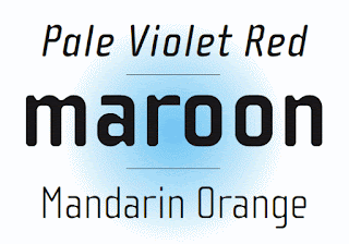


- Designer: Zuzana Licko
- What is different about the font: It has a geometric element to it yet has very subtle curves.
- How is it constructed: Designed with Macintosh computer and used proportions earlier Emperor 15 bitmap design and applied the computers geometric elements.
- What letters stand out: The lowercase v is an awkward shape because of how it has a point to the left side. The h and y are similar. The lowercase x is very interesting considering its not 2 simple straight lines crossing but more zigzag. -- The uppercase M is awkward as well because it looks kind of like an owl with the little "ears" that point at the top and the "v" shape connecting it a fourth of the way down. The A is interesting because of how round and skinny it is. Unlike quite a few of the other letters.
- 5 words: Awkward, Geometric, Thick, Straight, Arched.


Cholla
- Designer: Sibylle Hagmann
- What is different: The curves on the b, d, and so on. The curve is very thin on the edges on top and bottom.
- How is it constructed: Made sure it had great variety and the variety was needed to echo the schools nine different departments. Tried to get a unified feel to the type. It was also set out to make them feel comfortable making, and would serve a purpose and have a clear idea.
- What letters stand out: The uppercase J is very awkward because instead of the hook being round, it is a diagonal straight line attached to a vertical line. Not a big fan of that. The Q is interesting considering it is all curved with a subtle straight line on the bottom right edge. It doesn't go through the Q but is just attached at the edge. I like how the lowercase has thin points in the arches. It really brings out the curves in the type.
- 5 words: Curvy, Variation, Pointy, Simple, Thin.


Priori
- Designer: Jonathan Barnbrook
- What is different: Very pointy and thin horizontal lines on the edges with a few curvy edges as well. The dots on the i and j are diamonds, which is a very nice design element.
- How is it constructed: Prioti is a logical progression from Mason and is taken from British typography from the early 20th century.
- What letters stand out: The lowercase a is extremely awkward. Very straight, horizontal top, while the rest is curvy. Very unappealing. The j is different than most j's I see in font. it is very similar to the lowercase i. Hard to tell a different other than the j is longer. The uppercase J is still almost a straight line which makes for a more awkward uppercase J. The letter Q is interesting, it almost looks like a french horn how the line sticks out at the bottom.
- 5 words: Wide, Old-fashioned, Unappealing, Hectic, Confusing.


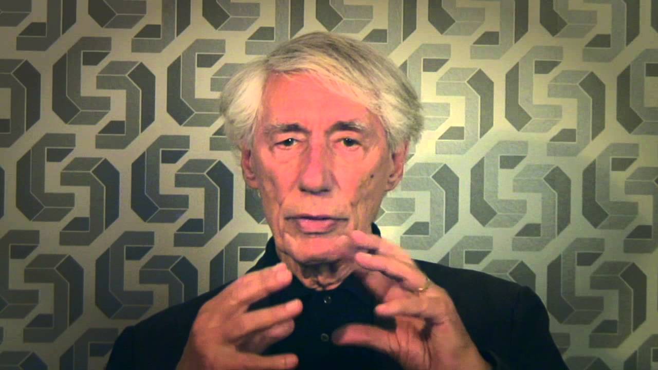
Who Is Wim Crouwel?
Wim Crouwel is a dutch graphic designer that was born in the Netherlands. In 1963, he founded the studio Total Design, which is now called Total Identity. Crouwel would plan out his typography extremely well based on precise grids. He published two typefaces Fodor and Gridmik and later got drafted into the army. After his completion of his service, he became an abstract painter. In 1954, he quit painting to become a freelance designer that was inspired by swiss design. Some of the awards Crouwel won in his lifetime included, Officer of the Most Excellent Order of the British Empire, Honorary Royal Designer for Industry, and Honorary Member of the Deutsche Werkbund.


Subscribe to:
Posts (Atom)