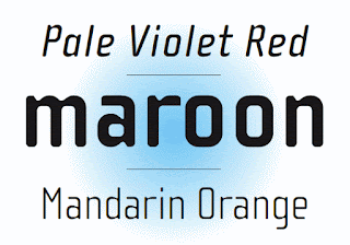
- Designer: Zuzana Licko
- What is different about the font: It has a geometric element to it yet has very subtle curves.
- How is it constructed: Designed with Macintosh computer and used proportions earlier Emperor 15 bitmap design and applied the computers geometric elements.
- What letters stand out: The lowercase v is an awkward shape because of how it has a point to the left side. The h and y are similar. The lowercase x is very interesting considering its not 2 simple straight lines crossing but more zigzag. -- The uppercase M is awkward as well because it looks kind of like an owl with the little "ears" that point at the top and the "v" shape connecting it a fourth of the way down. The A is interesting because of how round and skinny it is. Unlike quite a few of the other letters.
- 5 words: Awkward, Geometric, Thick, Straight, Arched.
Cholla
- Designer: Sibylle Hagmann
- What is different: The curves on the b, d, and so on. The curve is very thin on the edges on top and bottom.
- How is it constructed: Made sure it had great variety and the variety was needed to echo the schools nine different departments. Tried to get a unified feel to the type. It was also set out to make them feel comfortable making, and would serve a purpose and have a clear idea.
- What letters stand out: The uppercase J is very awkward because instead of the hook being round, it is a diagonal straight line attached to a vertical line. Not a big fan of that. The Q is interesting considering it is all curved with a subtle straight line on the bottom right edge. It doesn't go through the Q but is just attached at the edge. I like how the lowercase has thin points in the arches. It really brings out the curves in the type.
- 5 words: Curvy, Variation, Pointy, Simple, Thin.
Priori
- Designer: Jonathan Barnbrook
- What is different: Very pointy and thin horizontal lines on the edges with a few curvy edges as well. The dots on the i and j are diamonds, which is a very nice design element.
- How is it constructed: Prioti is a logical progression from Mason and is taken from British typography from the early 20th century.
- What letters stand out: The lowercase a is extremely awkward. Very straight, horizontal top, while the rest is curvy. Very unappealing. The j is different than most j's I see in font. it is very similar to the lowercase i. Hard to tell a different other than the j is longer. The uppercase J is still almost a straight line which makes for a more awkward uppercase J. The letter Q is interesting, it almost looks like a french horn how the line sticks out at the bottom.
- 5 words: Wide, Old-fashioned, Unappealing, Hectic, Confusing.


No comments:
Post a Comment